

The masonry layout in CSS
The “Masonry layout” is the name of a technique for creating a responsive grid of items with varying heights. Unlike a traditional grid, where items are arranged in columns and rows of equal size, the Masonry layout arranges items vertically, positioning each one based on the available space in a column.
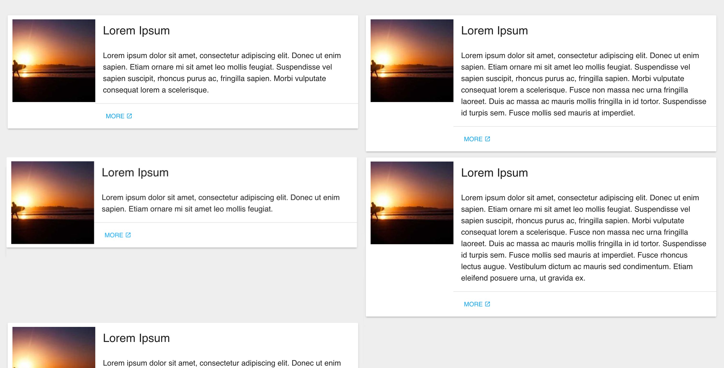 | 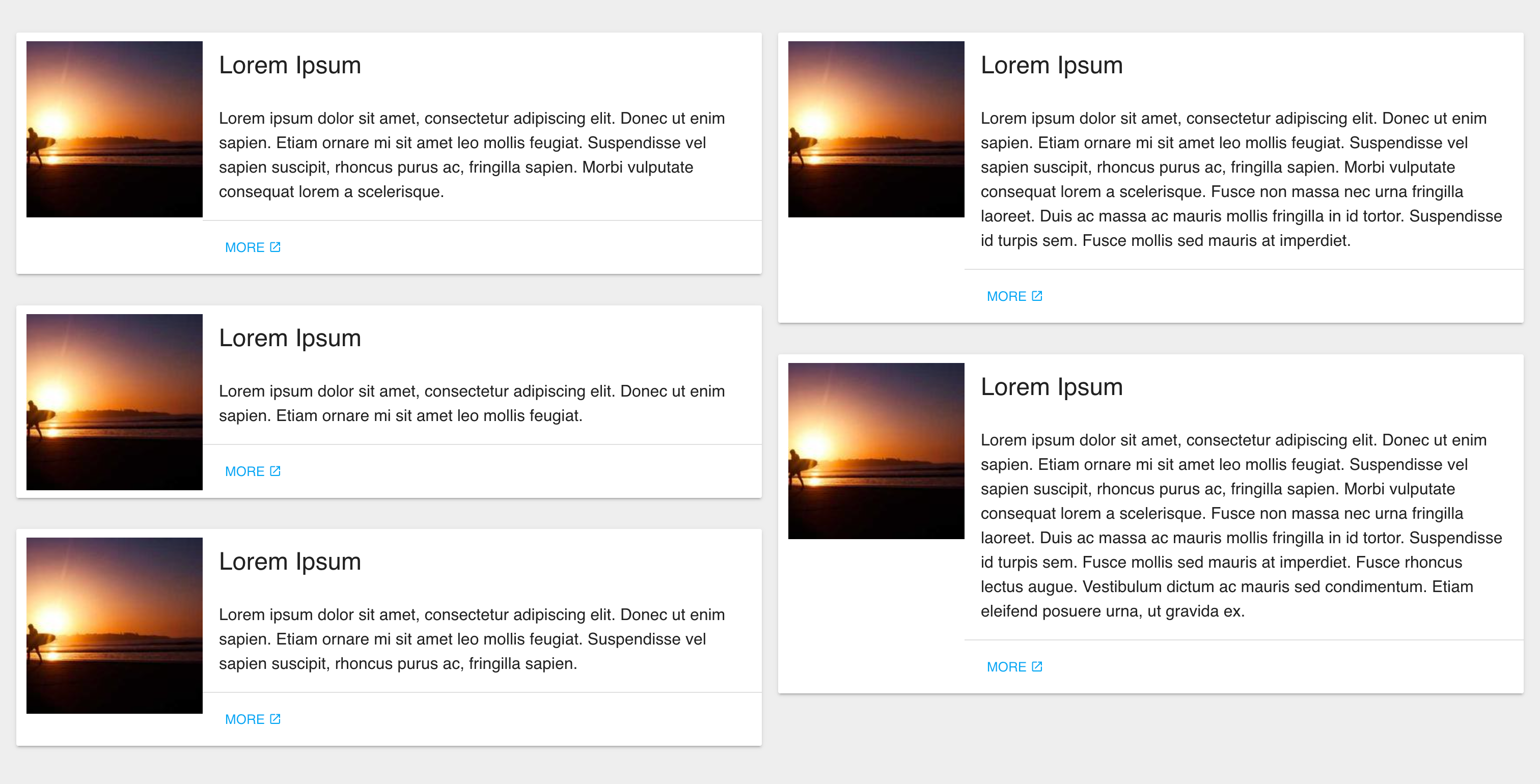 |
Example with and without the Masonry layout CSS ⤴
To create this layout, items are first grouped into columns based on their width.
Then, the items are positioned vertically based on the height of the shortest column.
As items are added or removed, the layout automatically adjusts to maintain a balanced appearance.
Here is the CSS to achieve a 2-columns layout:
.masonry-container {
    display: flex;
    flex-flow: column wrap;
    align-content: space-between;
    /*
     Your container needs a fixed height, and it
     needs to be taller than your tallest column.
     */
    height: 1300px;
}

.masonry-item {
    /* Each cards */
    width: 50%;
    margin-bottom: 1%;
}

/* Re-order cards into 2 columns */
.masonry-item:nth-child(2n + 1) {
    order: 1;
    padding-right: 8px !important;
}
.masonry-item:nth-child(2n) {
    order: 2;
    padding-left: 8px !important;
}

/* Force new columns */
.masonry-container::before,
.masonry-container::after {
    content: "";
    flex-basis: 100%;
    width: 0;
    order: 2;
}
Apply the masonry-container class on the top container and the masonry-item on each element inside the container just like so:
<div class="masonry-container">
    <div class="masonry-item" id="item-1"></div>
    <!-- … -->
    <div class="masonry-item" id="item-n"></div>
</div>
It supports responsive nicely too :) ⤵
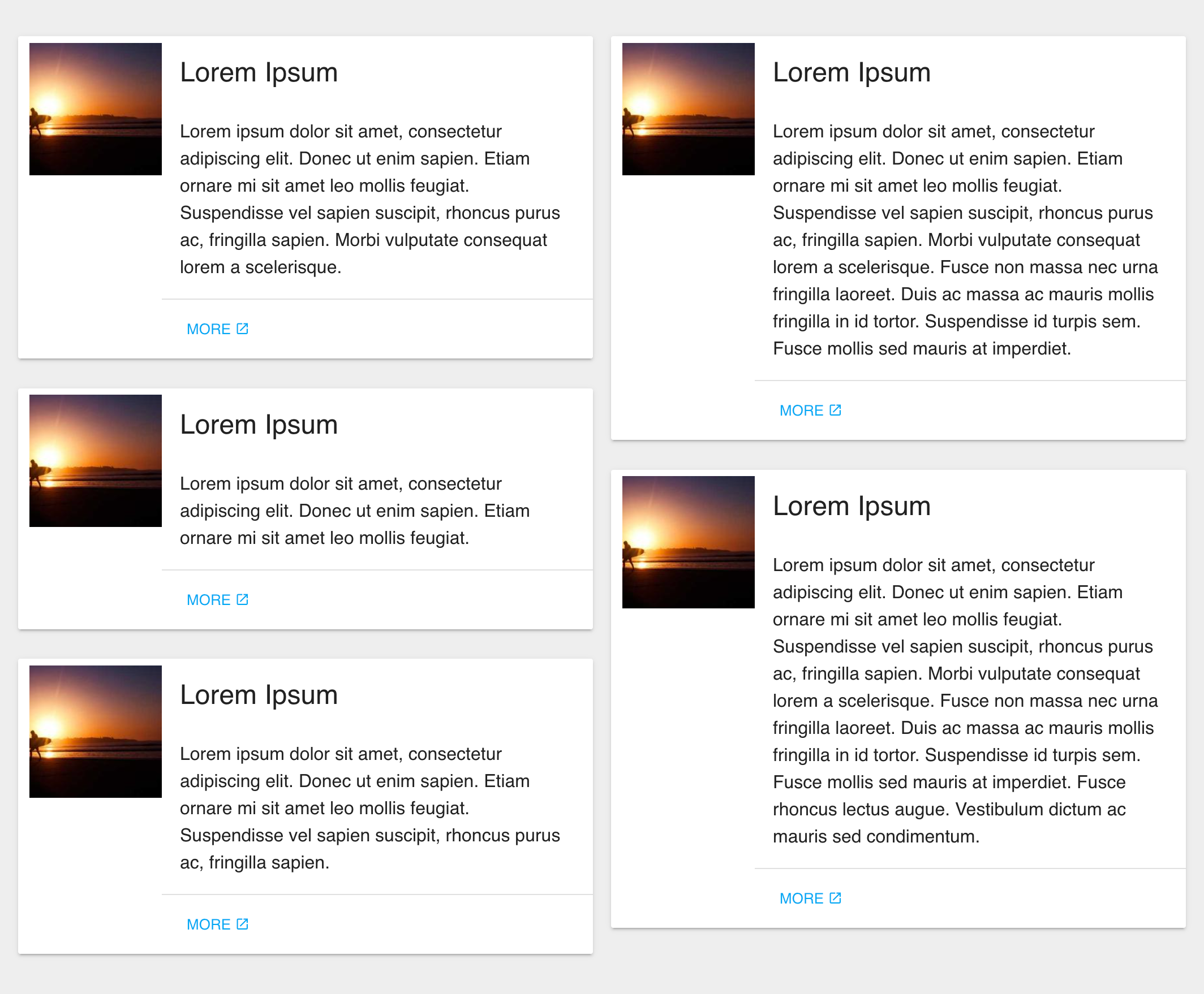 | 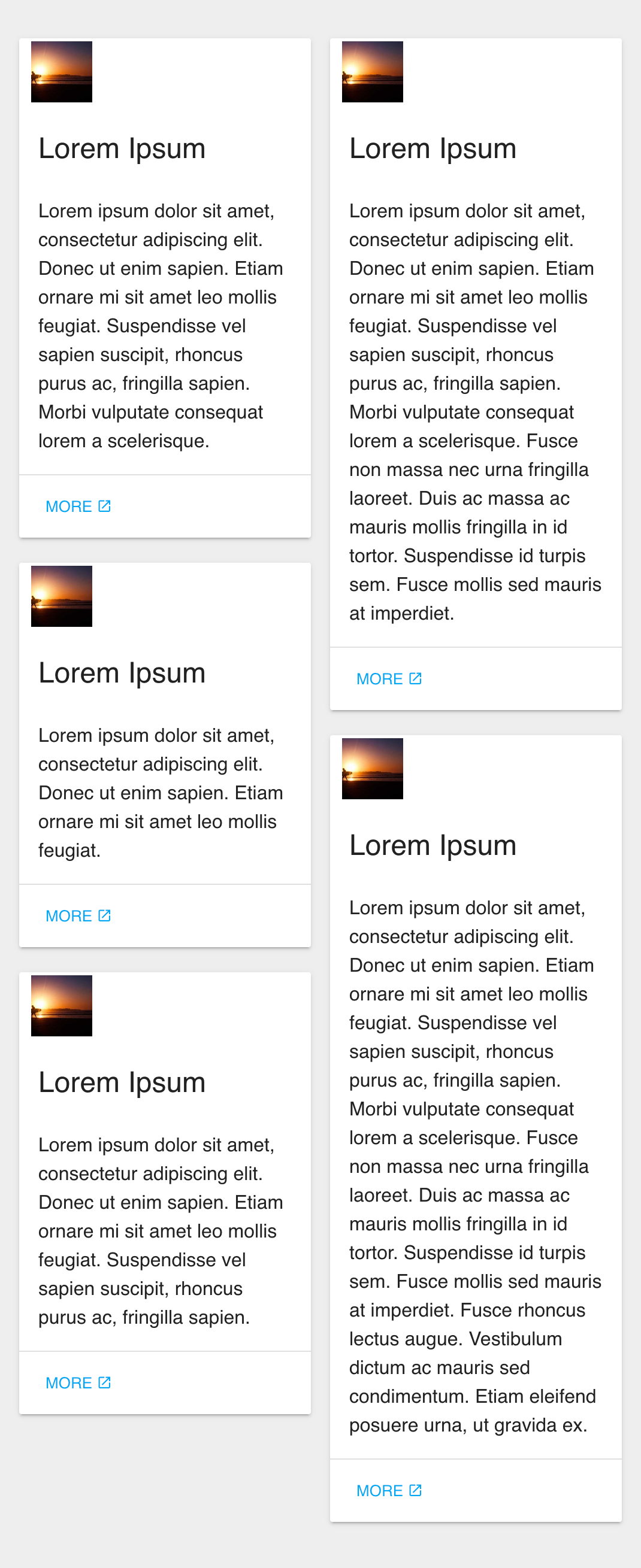 |